Kraft Mac & Cheese Line Unveils Revamped Visual ID
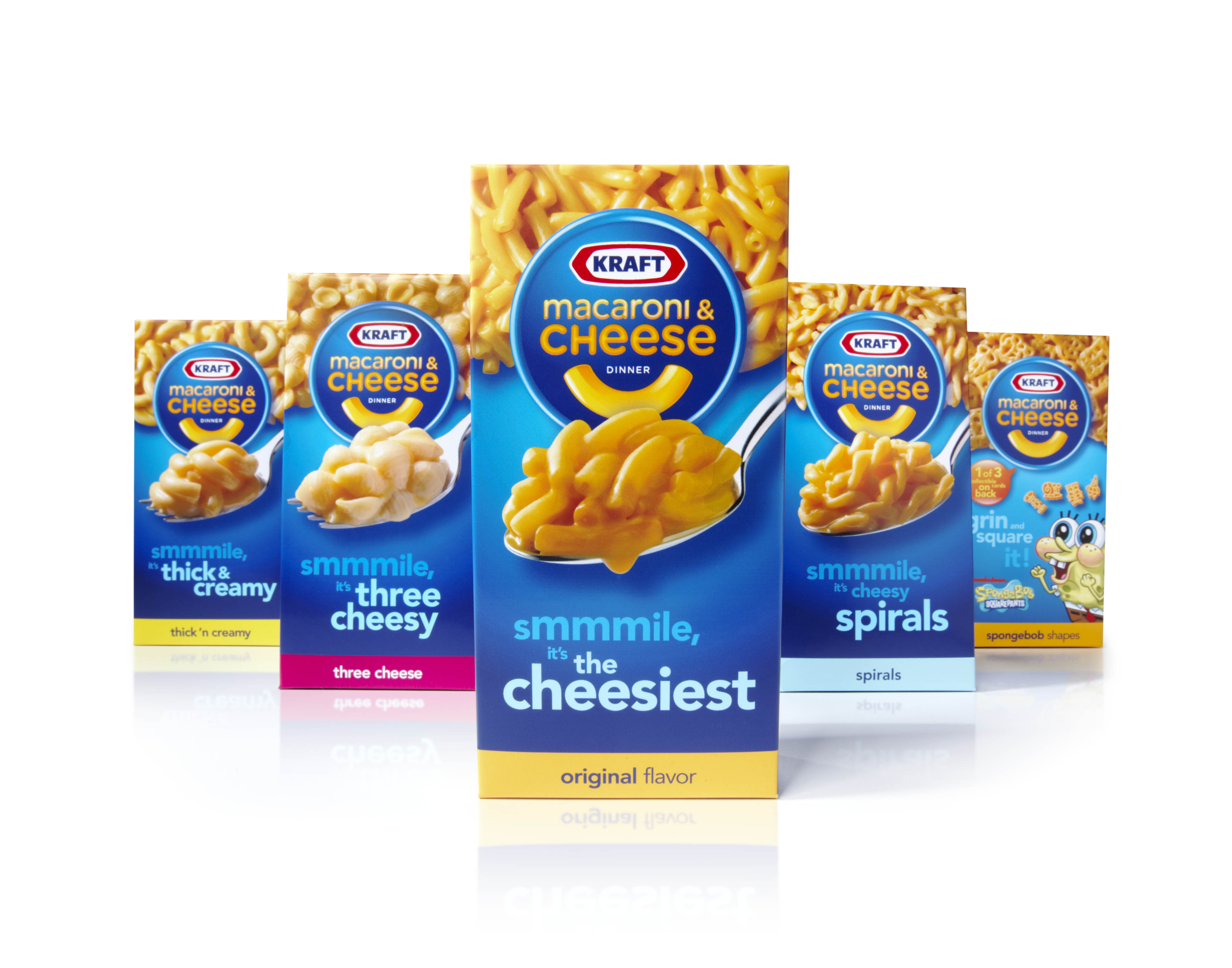 Kraft Foods is debuting a packaging redesign of its 73-year-old Kraft Macaroni & Cheese offering. The new visual identity, courtesy of brand consulting and design firm Landor Associates, retains key design elements that Americans identify with the Kraft Macaroni & Cheese, while incorporating a new “noodle smile” image that appears across all varieties and branding elements.
To create the fresh look, San Francisco-based Landor worked in concert with the brand’s many disciplines, including design and innovation, research and development, sales, and consumer insights. Preparation included consumer research that uncovered several key brand equities, among them happiness, smiles and joy. These equities went into the development of the “noodle smile.” visible on all branding elements, from the packaging on shelf to advertising on the street.
“Working with such an iconic brand requires a delicate balance of respect for its equities, and the foresight to know what will work,” explained Mary Zalla, managing director of Landor’s Chicago and Cincinnati offices. “Thanks to the research we conducted, we knew our solution was well grounded and would stand out on-shelf.”
To complement the new visual identity, Landor also worked on a toolbox including typography, shapes, colors, patterns and sound; a new brand architecture system that unifies the brand’s three subbrands (Macaroni & Cheese, Microwavable Dinner Cups, and Deluxe); and a brand communication style with a nomenclature system to support the new packaging, visual identity and advertising. All of these elements were components of an integrated brand marketing campaign that preceded the 2010 packaging rollout.
“We listened to our consumers and identified the opportunity to act as a single brand with a variety of delicious offerings, thus creating a unique brandmark to unify our portfolio and further differentiate the brand on shelf,” noted Hania Midura, director of design and innovation at Northfield, Ill.-based Kraft Foods. “This foundation set the stage for all of our partner agencies -- from advertising to creative -- to use the same elements, resulting in a more cohesive, and impactful brand across the board.”
The redesign is the biggest for the brand since 1999. The new packaging, backed by a multimillion-dollar ad campaign, is rolling out nationally through the end of the year and into 2011.