Strategic Supermarket Design Breathes New Life Into Stores
Today's supermarket customer is a sophisticated consumer. Like their parents and grandparents, they are seeking the lowest prices possible, but today's shoppers are also highly attuned to their shopping environment.
If two competing stores offer similar pricing value, consumers may choose to shop at the store providing the more rewarding shopping experience. They are also very active online shoppers and expect the brick-and-mortar locations to complement and reflect the online and social media presence.
Key Takeaways
- Exterior Design: Enhance the entry area for a strong focal point & positive first impression.
- Style: Adopt current trends in retail & food service tailored to brand identity.
- Interior Design: Create high and low interest areas where you, the merchandiser, wants them to be.
Supermarket owners and operators are as sophisticated and value conscious as their 21st- century customers — they have to be to remain competitive within a constantly evolving marketplace.
They know it is expected of them to maintain an up-to-date shopping facility that will provide a rewarding experience for the hands-on shopper and not disappoint the online customer when they arrive to pick up their order. They also know that the customer is watching how new-construction and renovation dollars are being spent, often assuming that an opulent renovation will cause a detrimental rise in prices.
Managers on the ground know they need to keep their store current — without spending too much, or appearing to spend too much. Most intuitively know what to do — now let's discuss how to do it.
Curb Appeal
This is a proven concept in real estate marketing. Realtors know that providing a great impression from the "curb" will get the prospective buyer to take the next step and investigate a property further.
Supermarkets also have — or lack — curb appeal, be it from a main street, highway or parking lot. Just like a prospective home owner, a shopper will often form their first impression when viewing the front façade.
Supermarket operators rarely have an unlimited budget to lavish on exterior façades, so they must be strategic about where to spend their construction/renovation dollars. When approaching a building, be it residential or retail, most people will look for the entry first — this is where you will make your most important first impression.

The entry area is your customer's natural focal point. That's good news, as the store entry is a limited area where an owner can focus construction funds, as opposed to the greater expanse of the remaining façade.
Even though many owners are aware of this concept of enhancing the entryway to achieve maximum curb appeal for minimal dollars, missteps in application can still occur.
Style
The appropriate style for a supermarket is determined not by an owner's personal taste, but rather by the consensus of consumers.
In other words, it is a style that will appeal to the greatest number of potential customers. It tends to be less a radical look ahead to futuristic designs (or a look behind at the past) then a style very much of the present.
It only takes a look around at the recently implemented high-stakes styling of national fast-food chains to get a sense of what today's consumers expect to find in places where they spend their time and money.
Supermarket architecture has been slow to join in this trend, but again, there is good news: Most existing supermarket architecture is naturally adaptable to these trending forms, especially if handled cleverly by a savvy designer or architect.
Clean, crisp geometric forms focusing on the entry area and integrated with sweeping horizontal canopies, existing storefront windows and new signage can create an impactful up-to-date first impression without resorting to structural gymnastics or the overuse of expensive materials.
When implemented successfully, the architectural design complements and reinforces brand identity.
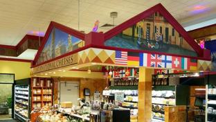
Interior Design
With the advent of economical large-format digital printing, there has been a proliferation of colorful wall coverings, often applied to every available wall surface, overwhelming the customer and taking the focus away from the product being sold. The old adage that "too much of a good thing is not good at all" could apply here.
Keeping budget in mind when designing the interior decor of a store will help the owner (or owner's designer) to highlight selected focal points such as high return service and specialty departments.
If all areas of the store have equal impact, it may be beautiful, but it will also likely be visually confusing and overly busy.
The other extreme of applying equal austerity to all surfaces must also be avoided, as it can lead to visual monotony, lethargy on the part of the customer and a "cheap" appearance.
As in most areas of good design, a well-orchestrated balance of high and low visual impacts will keep the customer interested and help actualize management's merchandising philosophy, rather than neutralize it with too much visual noise.
About the Author